D. O. WDesign of the Week
|

|

DOW 1
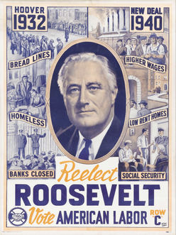
This is a poster to re-elect Franklin Delano Roosevelt. What I like about the poster is the formal balance. The major events of his term are reflected in the array of events--three on the right and three on the left. The center of interest is the ellipticIe photo bullseye in the center. I also like the muted colors which are only slightly warm.
|
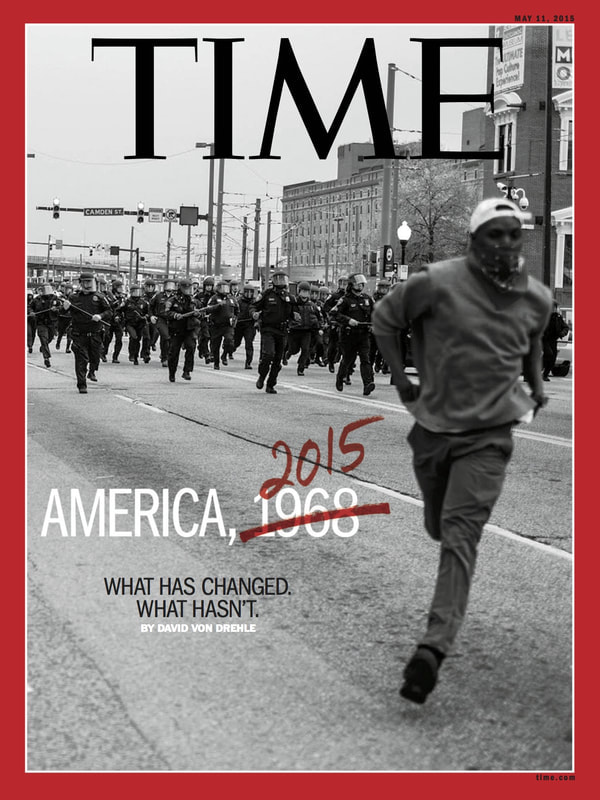
This is a magazine cover for Time which
|
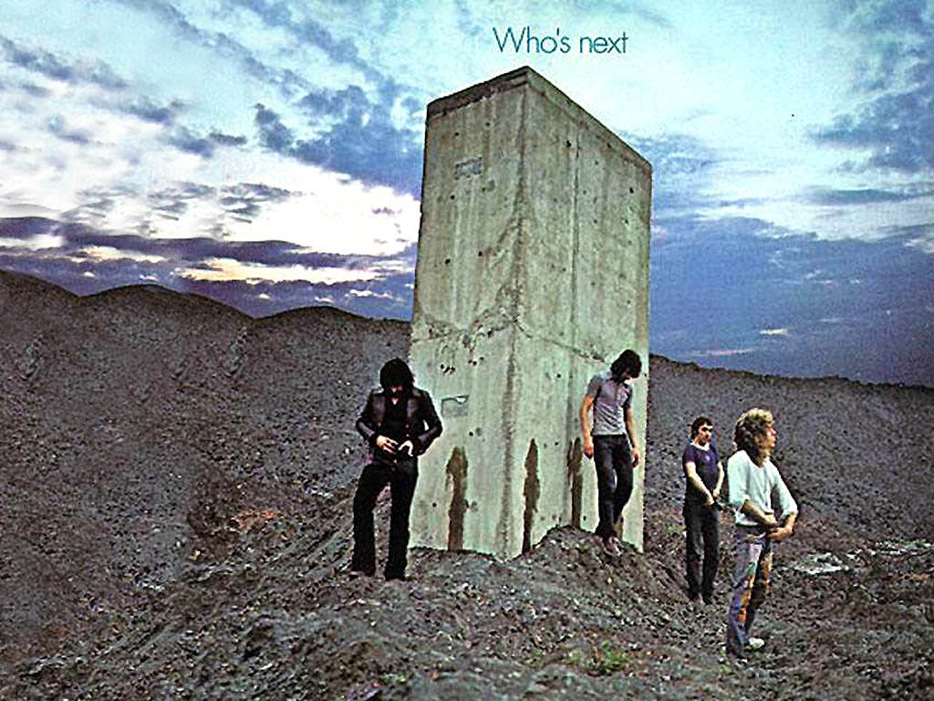
This is an album cover for the Who which is a band. What is interesting about the photo is first it is COOL. It uses cool colors. I also like the texture which is earth and sky but ultimately shows up in the obelisk. The characters seem to be hitching up their pants. Who's next is a question that is pretty open to interpretation.
|
The easy way of doing Design of the week is to use the gallery and do the 25 word write up directly on the photo. After you get around six entries it can be tricky so you might then do a separate gallery. The advantage is it is all nice and neat.
If you choose to do separate images and text, that is OK as well. Put the most recent at the top and please list which DOW you are writing about. It gets confusing after 15 or so.
